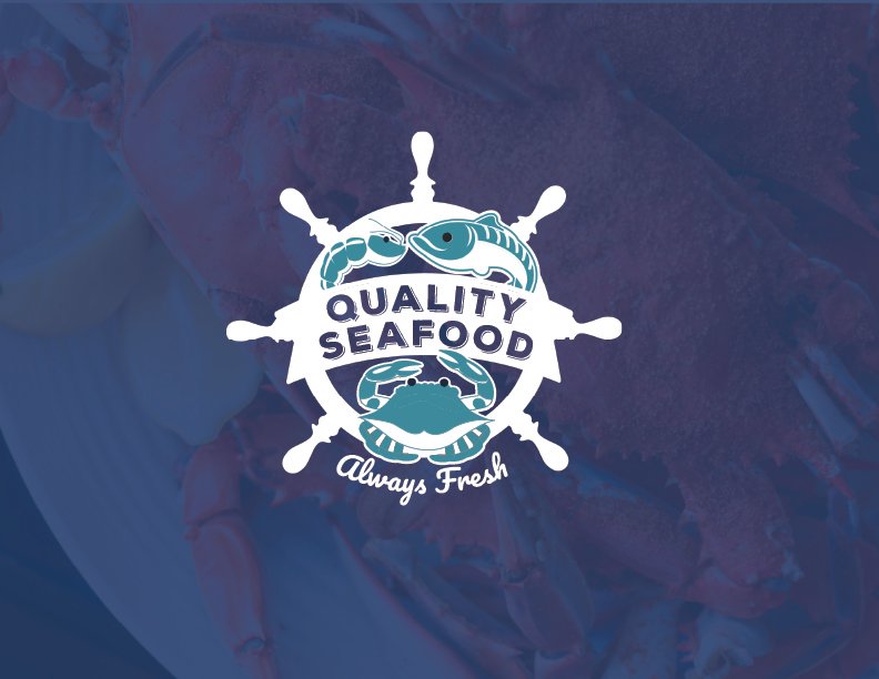
Client: Quality Seafood
Role: Branding
Quality Seafood is a family-owned and operated seafood carry-out that specializes in Maryland blue crabs, shrimps, crab cakes, and fried fish. The logo features the three cornerstone elements of their business, which are crabs, shrimp, and fish The calming blue hue not only pays homage to the ocean's bounty but also represents the brand loyalty to always using the freshest ingredients.
What I Worked On:
Brand Strategy
Visual Brand Identity Design
Print Collateral
Client: Love Always Wedding Planning
Role: Re-branding
What I Worked On:
Brand Strategy
Visual Brand Identity Design
Social Media Templates
Print Collateral
Website
Love Always is a luxury wedding planning service based in Newport News, VA, renowned for curating unforgettable, high-end wedding experiences that are both elegant and deeply personal. To capture the essence of Love Always and elevate its presence within the luxury wedding market, I developed a comprehensive luxury brand identity that reflects the company’s dedication to thoughtful, high-end service. The goal was to create a brand that exudes elegance, timelessness, and inclusivity, all while resonating with modern couples looking for a bespoke, unforgettable wedding experience. This rebranding effort encompassed everything from a refreshed logo to a custom color palette that appeals to all genders, ensuring that the brand is approachable, yet still luxurious and refined.
The newly developed color palette was crafted to reflect Love Always’ inclusive ethos and wide-ranging clientele. By incorporating soft, neutral tones like champagne, cream, and warm blues, the palette conveys a sense of romance, elegance, and luxury without being overtly gendered. This careful balance creates a welcoming, yet opulent visual identity that appeals to couples from diverse backgrounds, making it perfect for both traditional and non-traditional weddings.
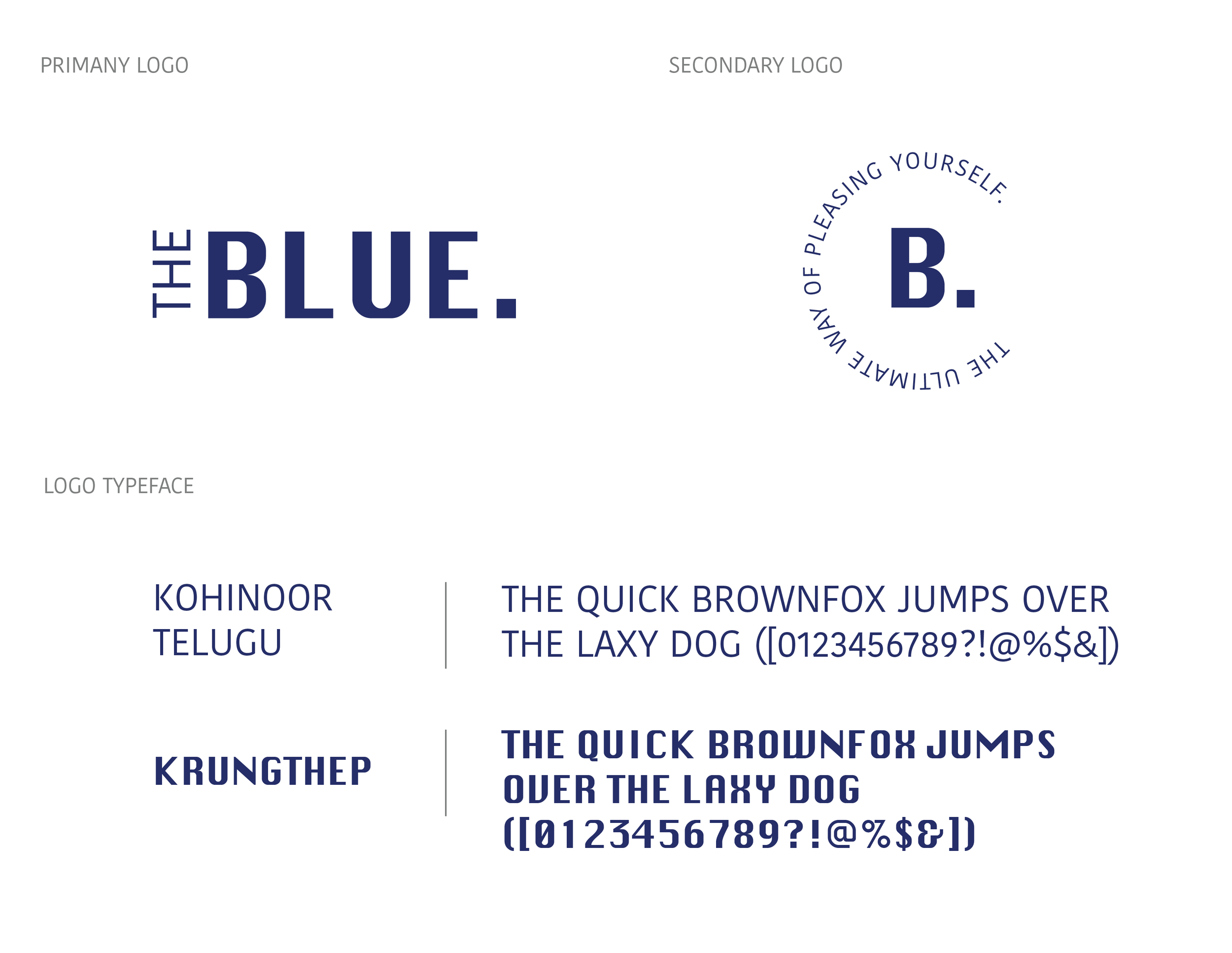
Conceptual Design
Role: Branding
What I Worked On:
Brand Strategy
Visual Brand Identity Design
Website
THE BLUE. is a forward-thinking, sustainable denim brand with a deep commitment to environmental responsibility and inclusivity. At its core, the brand is driven by the belief that fashion should not come at the cost of the planet’s natural resources. By focusing on recycling and repurposing materials, THE BLUE. plays a key role in reducing waste, conserving energy, and helping to minimize the environmental footprint of the fashion industry. Every aspect of the brand—from its sourcing of materials to its production processes—is guided by a desire to promote sustainability and conscious consumption.
Central to THE BLUE.’s philosophy is its use of recycled fabrics. The brand creates its collections by sourcing and upcycling materials from discarded or second-hand jeans, giving them a new life while reducing the need for virgin resources.
Client: Too Sweet Party Events
Role: Logo Design
Too Sweet Party Events is a local pastry business that specializes in creating elegant, boho-themed treats, offering a range of beautifully crafted desserts that combine sophistication with a whimsical, earthy charm. Too Sweet Party Events focuses on creating desserts that are both visually stunning and tastefully refined.
The brand and logo were carefully designed to reflect the essence of the business, capturing a distinctly feminine, classy, and modern bohemian aesthetic. The logo embodies a delicate balance between elegance and playfulness, with soft, muted tones like blush pink, cream, and earthy pastels evoking a sense of warmth and sophistication. The typeface and logo design are refined yet approachable, resonating with the boho-chic vibe that Too Sweet Party Events is known for. This alignment ensures that the brand’s visual identity perfectly mirrors the vision and values of the business: creating sweet experiences that are as stylish as they are delicious.
Client: Emmy's Treasure Cover
Role: Logo Design
Emmy’s Treasure Cove is a boutique business that stands out for its specialty in designing custom cups and tumblers, each piece crafted with meticulous attention to detail and personalization. The branding and logo of Emmy’s Treasure Cove are deeply inspired by an enchanting "under-the-sea" theme, which evokes a sense of discovery, mystery, and adventure. The imagery draws from elements like hidden treasures and mythical creatures, reflecting Emmy’s creative vision and passion for both artistry and storytelling.
Client: Ashland Town Hall
Role: Signage Design
A comprehensive signage system was designed for the New Town Hall of Ashland, with the primary goal of creating a cohesive and unified visual identity while ensuring clarity in the identification and navigation of the building’s various spaces. The design of the signage system focused on combining aesthetic appeal with functionality. It incorporated modern typography, clear icons, and a consistent color palette that aligned with the architectural style of the New Town Hall, helping to create a seamless blend between the signage and the overall environment.
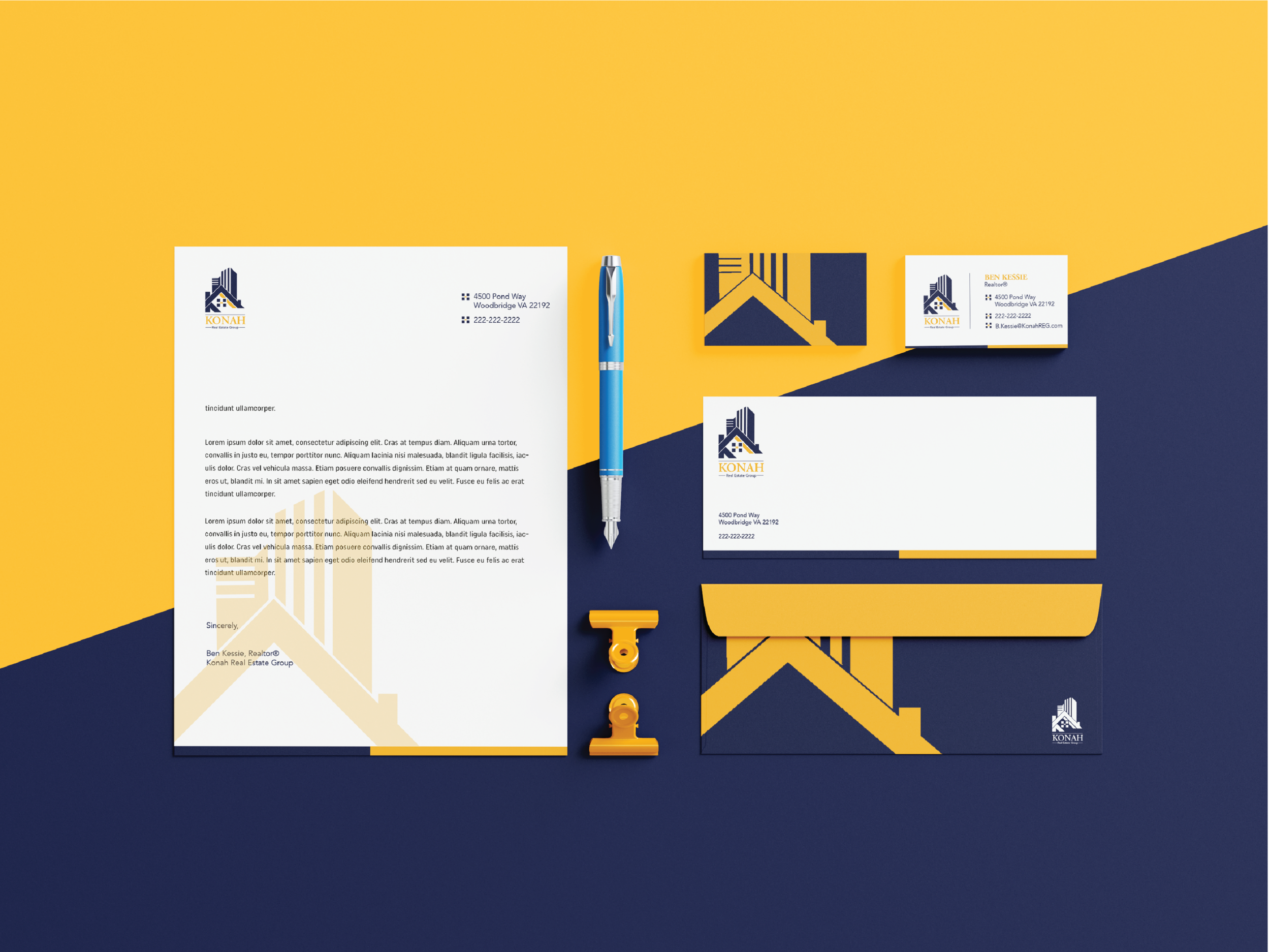
Client: Ben Kessie, REALOR®
Role: Logo Design
The logo design for the company masterfully combines the initial "K" from the company name with visual elements deeply rooted in the language and iconography of the real estate market. The "K" is crafted in a way that reflects the structure, stability, and precision associated with real estate, evoking images of buildings, homes, and solid foundations—key elements that resonate with clients looking for reliability in the market.
Embedded within the logo is the NSAA (National Society of Accountants for Cooperatives) symbol, which plays a significant role in reinforcing the brand’s core values of excellence, authenticity, and integrity. By incorporating the NSAA symbol, the logo speaks to the client’s dedication to high ethical standards and professionalism within the real estate industry.
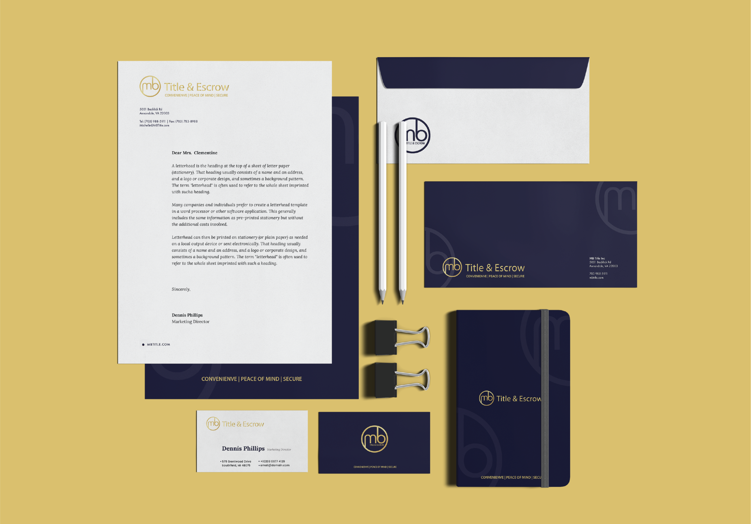
Client: MB Title and Escrow
Role: Logo Design
The logo for the company thoughtfully combines the initials “M” and “B” within a circular frame, symbolizing the core values of security, trust, and peace of mind that the company stands for. The circular form is a timeless and universally recognized symbol of unity, wholeness, and protection. By placing the initials within this shape, the logo visually communicates a sense of completeness and stability—qualities that clients seek when engaging with a company that prioritizes safety and reliability. The circle serves as a protective boundary, reinforcing the idea that the company creates a secure environment for its clients, whether through its services or products.
Concept Design
Role: Branding
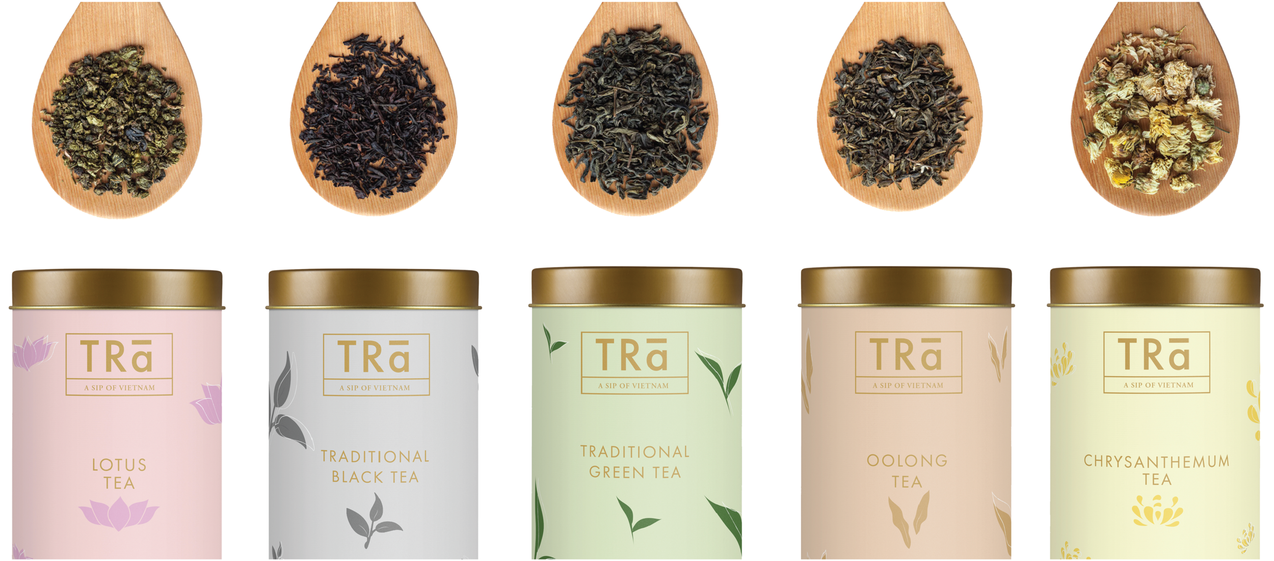
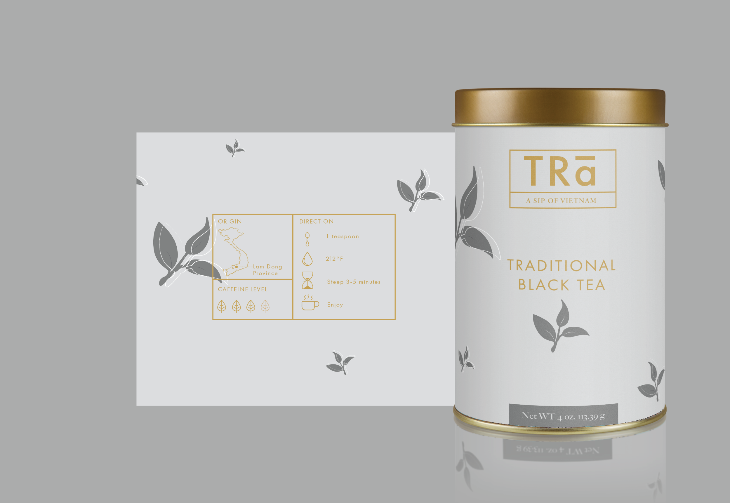
Trà is a premium Vietnamese tea brand that celebrates the country’s rich cultural heritage and diverse landscapes through its selection of five distinct types of tea. Each variety in the "Five Teas" collection is carefully curated to reflect the unique geography of Vietnam’s regions, offering tea lovers an immersive experience of the nation's natural beauty and flavors. From the lush, misty highlands to the fertile lowlands, the coastal plains, and tropical forests, these teas capture the essence of Vietnam’s varied terrains through their distinctive aromas, colors, and tastes.
Northern Highlands Tea: This variety is sourced from the mountainous regions of northern Vietnam, where cool climates and high elevations provide the perfect conditions for growing tea with a rich, full-bodied flavor. The tea from this region typically has earthy and floral notes, representing the rugged beauty of the region’s terraced landscapes and ancient tea-growing traditions. Its deep, amber color and fragrant aroma are reminiscent of the mist-covered peaks and cool, crisp air of the northern highlands.
Central Plateau Tea: Grown in the central highlands, this tea reflects the area’s fertile volcanic soil and warm, sunny climate. Known for its bright, lively flavors and light, golden hue, this tea offers a refreshing taste with subtle hints of fruit and wildflowers. It embodies the vibrant, sunny landscapes of the central region, where rolling hills and plantations stretch as far as the eye can see, and the scent of tea leaves fills the air.
Coastal Tea: Sourced from Vietnam’s coastal plains, this variety is influenced by the salty breezes and tropical humidity of the ocean. Its flavor is delicate, with a hint of salinity and a soft, smooth finish that evokes the gentle waves and sandy shores of the Vietnamese coast. The light, pale green color of the tea mirrors the sparkling waters of the sea, while its refreshing aroma transports the drinker to a tranquil beachside setting.
Mekong Delta Tea: Reflecting the lush, tropical environment of the southern Mekong Delta, this tea is rich, smooth, and slightly sweet. The fertile river plains where it is grown impart a distinctive sweetness and depth of flavor, symbolizing the abundance of the region’s agricultural heritage. Its deep green color and fresh, vegetal taste echo the dense greenery and flowing rivers of the delta, making it a vibrant representation of southern Vietnam’s fertile heart.
Tropical Forest Tea: This exotic tea variety comes from the tropical rainforests of Vietnam, where the rich biodiversity and warm, humid climate give the tea a bold, aromatic profile. With strong herbal notes and a complex flavor, this tea reflects the wild, untamed nature of Vietnam’s forests. Its dark, reddish hue is reminiscent of the dense canopy and jungle floor, and its scent carries a sense of adventure, as if transporting the drinker into the heart of the rainforest.
Each tea in Trà's collection is not only a sensory journey through Vietnam’s diverse geography but also a tribute to the country's centuries-old tea culture. The brand emphasizes the authenticity of traditional Vietnamese tea-making practices, with careful attention to sourcing, processing, and blending, ensuring that every cup of tea offers a true taste of the region from which it originates.
The packaging design further enhances this connection to Vietnam’s geography, with artwork that depicts the landscapes and cultural elements unique to each region. The use of vibrant colors and intricate patterns on the packaging reflects the beauty of Vietnam’s natural scenery, allowing the tea to appeal not only to the palate but also to the eye.
Concept Design
Role: An Adoption App
PAWIT is a thoughtfully designed app created specifically for animal foster homes, with the goal of streamlining and simplifying the pet adoption process. Unlike traditional adoption routes that often require potential pet owners to go through shelters, PAWIT provides a direct connection between foster homes and individuals looking for their perfect pet companion. This innovative platform aims to reduce the stress on animals and foster families by offering a more personalized, efficient, and informative adoption experience.
To keep users engaged and make the adoption journey enjoyable, PAWIT is designed with colorful, inviting visuals and an intuitive user interface. The app’s vibrant design reflects the joy and excitement that comes with finding a new best friend, creating a welcoming environment that encourages users to explore, learn, and connect with foster animals. Bright, cheerful colors, playful icons, and friendly typography all contribute to making the app feel accessible and fun to use for people of all ages.
PAWIT is also designed with convenience in mind, allowing users to browse available pets by filtering criteria such as size, age, breed, energy level, and even specific care needs. This functionality helps users quickly identify pets that match their preferences, cutting down on time and reducing the uncertainty often associated with finding the right pet. Foster homes, in turn, can also provide personalized notes about each animal, offering insights that might not be available in a traditional shelter setting, such as favorite toys, special quirks, or ideal home environments.
Conceptual Design
Role: Editorial Design
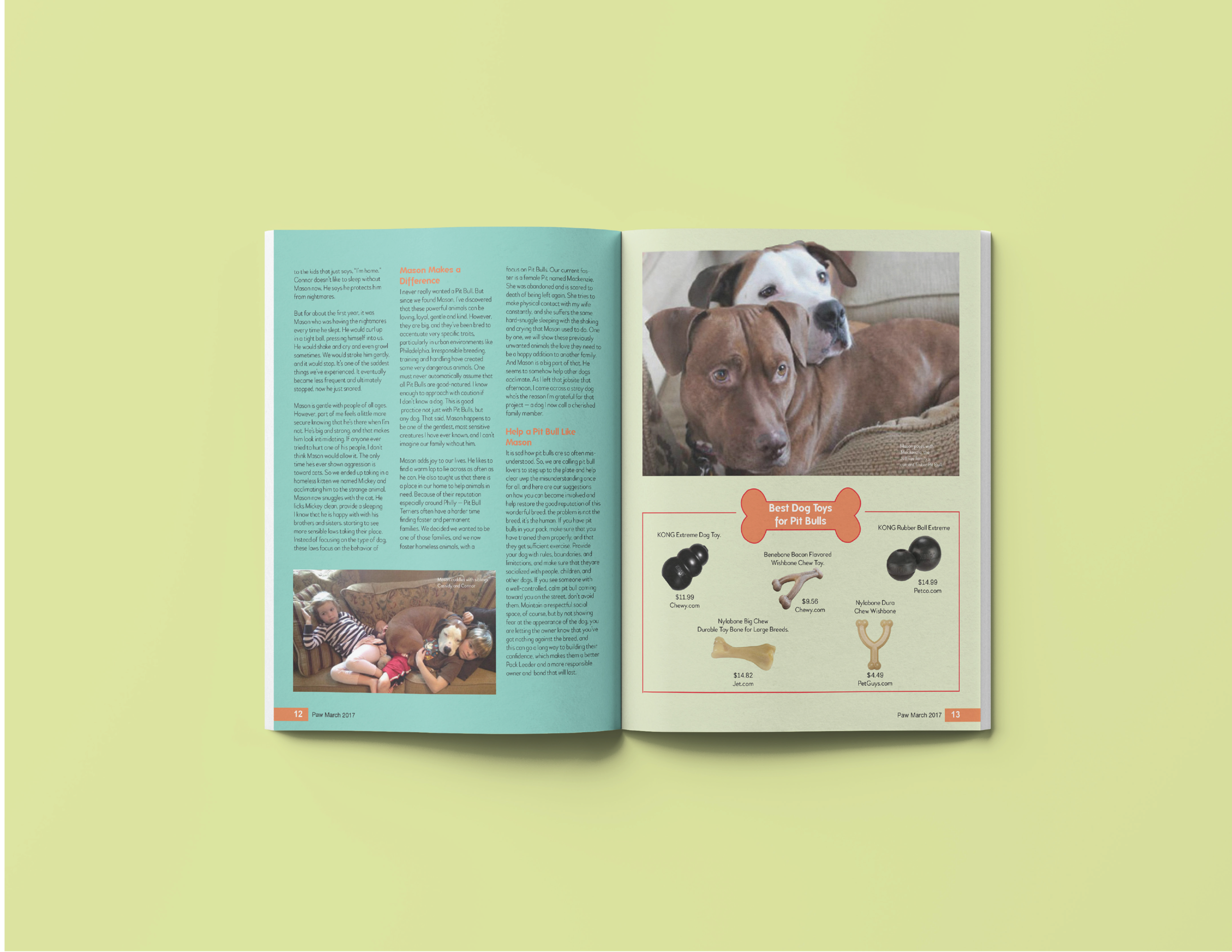
“Paw” is a children’s editorial design that blends education and entertainment, creating an engaging platform for young readers to learn about various topics in a fun and captivating way. Each issue of “Paw” focuses on a different theme, with an emphasis on fostering curiosity, empathy, and understanding in children. Through a combination of storytelling, facts, and interactive activities, “Paw” makes learning an exciting adventure for its audience.
In this month’s issue, the spotlight is on the Pitbull breed, chosen for its rich history and the incredible stories that challenge common misconceptions about these dogs. Pitbulls are often misunderstood due to negative stereotypes, but “Paw” seeks to highlight their loyal, gentle, and courageous nature through real-life stories of resilience, companionship, and bravery.
Conceptual
Role: Poster Design
A poster series focused on the different perspectives of the pitbull breed. The decision to used pure, bright colors along with illustrations, and some educational facts were in hope of bringing people to understand the facts instead of the misconceptions from the media.
Pop-Up Store
Role: Designer
A campaign opportunity to explore and challenge the idea of labeling. The purpose of this pop-up store was to show the notion of being able to be different. Individuals can proudly wear a product that represents who they are or what defines them personally. To be able to unite and standout in a community. The blank space offers a moment where people can the same or different in the smallest ways through a single word.